Reply #126 Top

Thanks guys, I will look into it. :-) Nevertheless, something more simple after all the industrial bombast. Ideas flowing in my head that need to get free.

Reply #128 Top
Quoting ppetroff60, reply 4145528

Respected c242! Is it possible to create Start menu buttons?

End of ppetroff60's quote

Will do!

+1 Loading…
Reply #129 Top
Quoting DrJBHL, reply 4145510
Quoting c242, reply 4145501

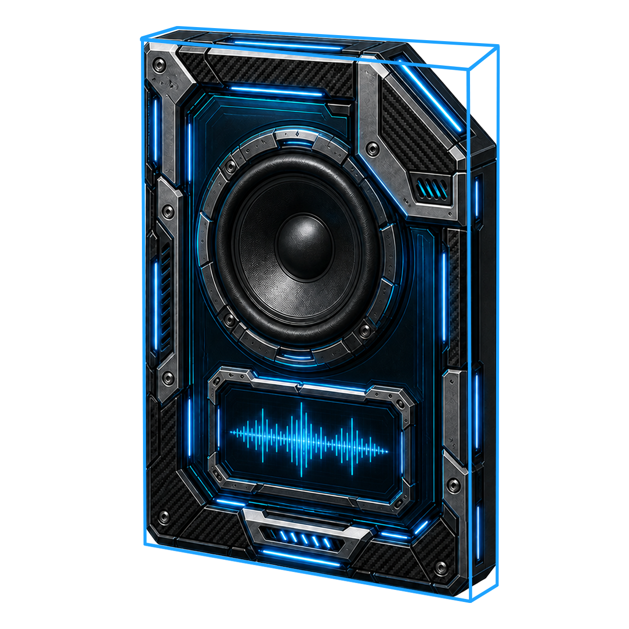
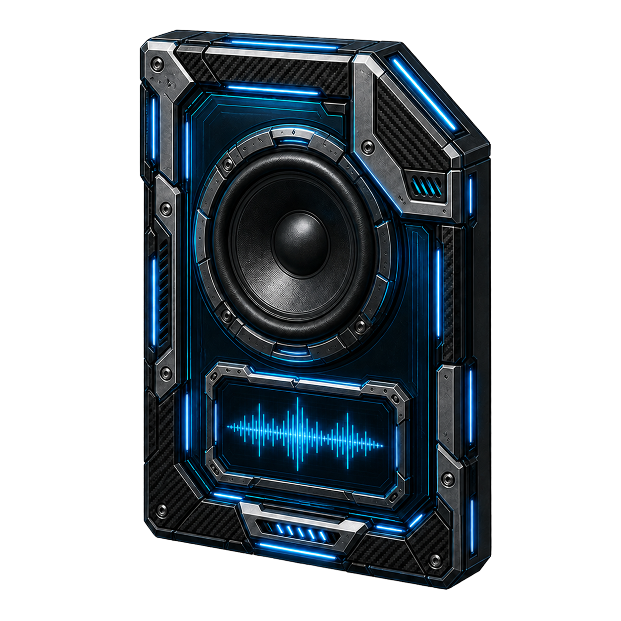
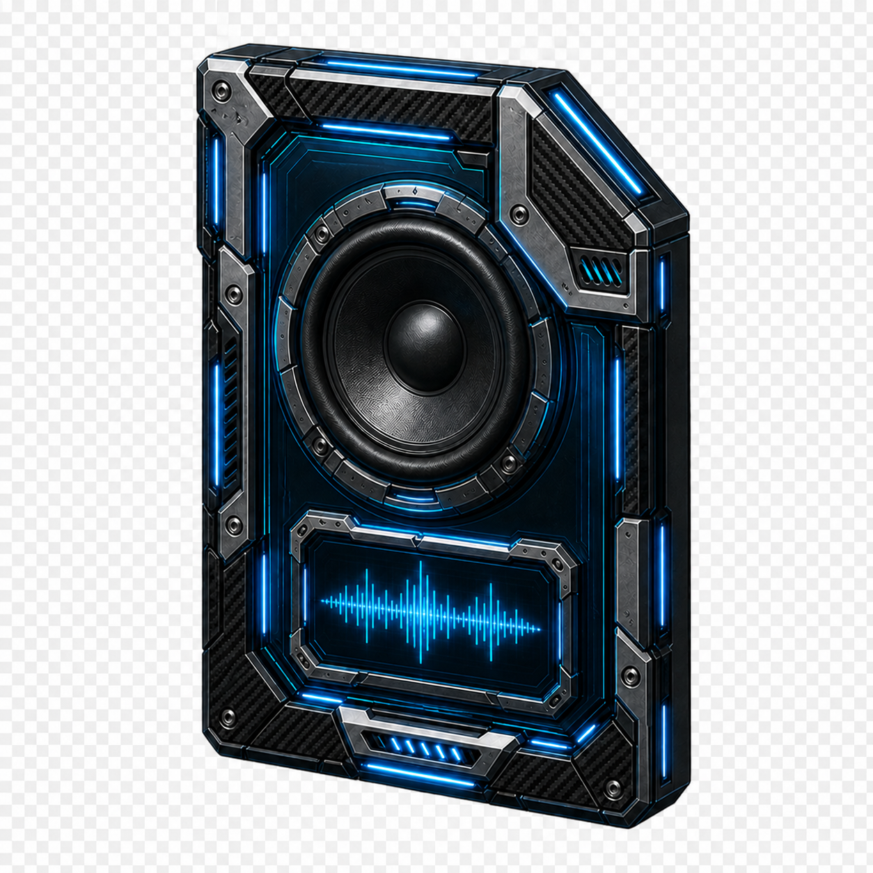
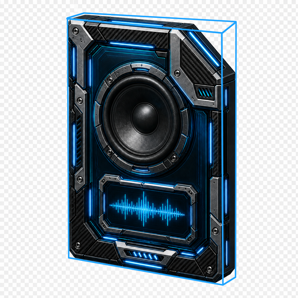
The details in the new iconset I m working on are totally crazy. Imagine how many Photoshop layers this would take for just one icon.

End of c242's quote

Carl, the perspective looks slightly off on the vertical arm of the gray L shaped piece to me.

End of DrJBHL's quote

Reply #130 Top

This is what I see. Maybe I'm looking at it wrong, but I think it's that chamfered corner that's causing the issue with the perspective.

The first image is the original icon with a perspective wire frame. In the second image I changed the perspective to match the wire frame, and the third image is the corrected image without the wire frame. I still think the right (foreword) side is too thin compared to the thickness of the left (back) side, but that's more subjective.

Carl, I'm really not criticizing your work, I'm just bored on a Sunday and trying to stay busy. AI seems to have a real problem getting perspective correct, based on what I've seen in the Galleries. Thankfully there are no fingers in this design.


1     2     3
 

Reply #131 Top
Quoting pelaird, reply 4145533

This is what I see. Maybe I'm looking at it wrong, but I think it's that chamfered corner that's causing the issue with the perspective.

The first image is the original icon with a perspective wire frame. In the second image I changed the perspective to match the wire frame, and the third image is the corrected image without the wire frame. I still think the right (foreword) side is too thin compared to the thickness of the left (back) side, but that's more subjective.

Carl, I'm really not criticizing your work, I'm just bored on a Sunday and trying to stay busy. AI seems to have a real problem getting perspective correct, based on what I've seen in the Galleries. Thankfully there are no fingers in this design.


1     2     3

End of pelaird's quote

Hit me, but I don't see much of a difference. I think Joe User will not sit at home with a protractor and go through every icon. ;-p Apart from the fact that this is done for a few deskmodders left and the interest has become disappointing low for things like this (not to belittle the few people that like it, I am thankful for everyone!!!! <3 ).  Nevertheless, constructive criticism is very welcome here everytime, where, when not on WC? :-)

Reply #132 Top

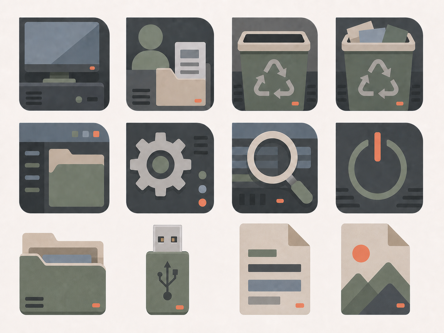
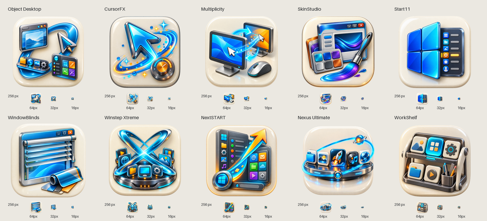
Corporate work, stone themed more "happy" icons. ;-)

Größenprüfung Los A12

+6 Loading…
Reply #133 Top
Quoting c242, reply 4145542

Corporate work, stone themed more "happy" icons.

End of c242's quote

Very spiffy, Carl! :beer: :beer: 

Reply #134 Top

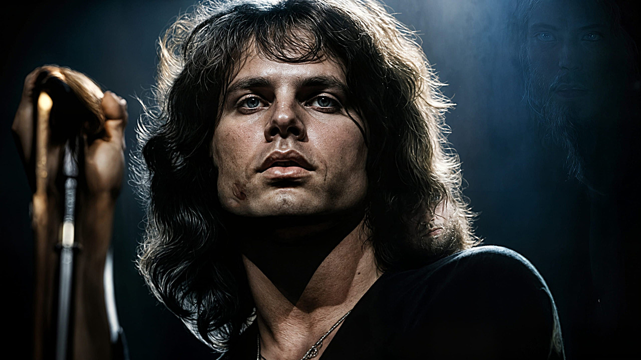
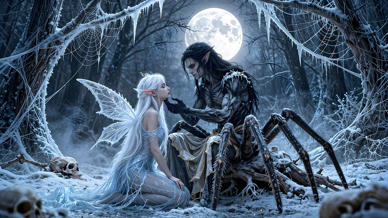
The Legend Lizard King

The Lizard King

Reply #135 Top

Forgotten Things

Forgotten Things

+1 Loading…
Reply #136 Top

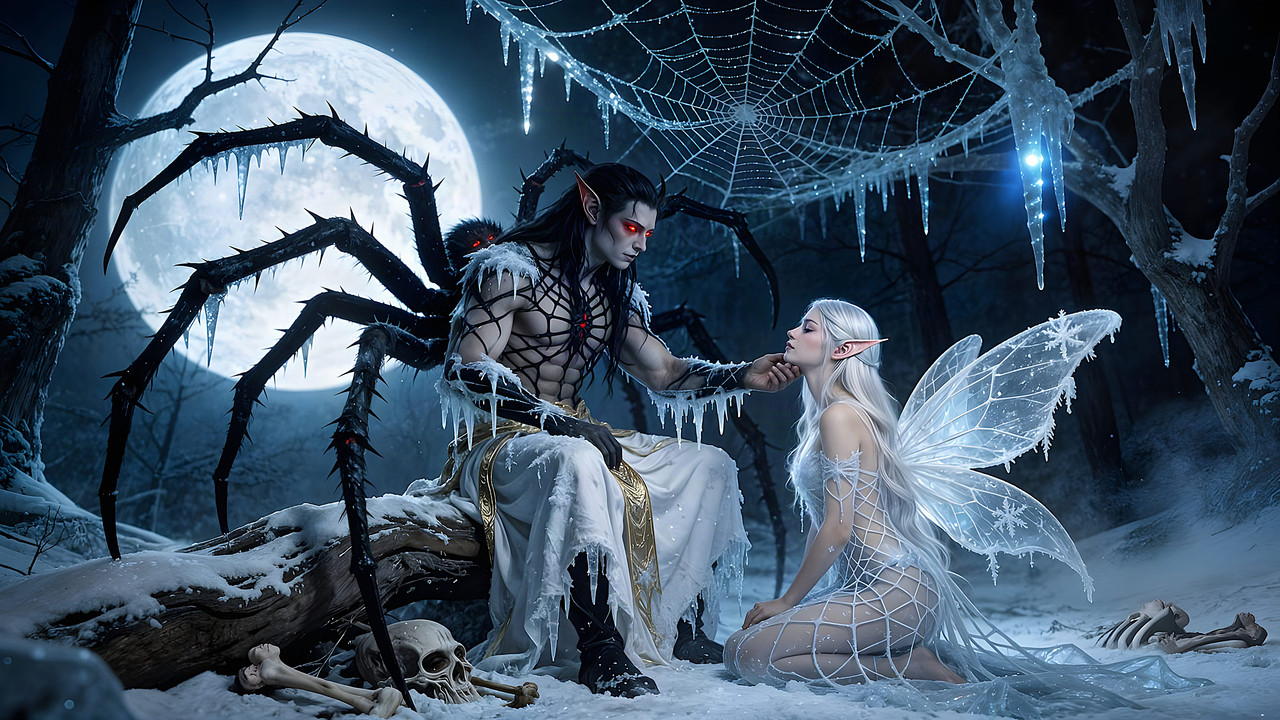
Swallowed Alive

Swallowed Alive


Reply #137 Top

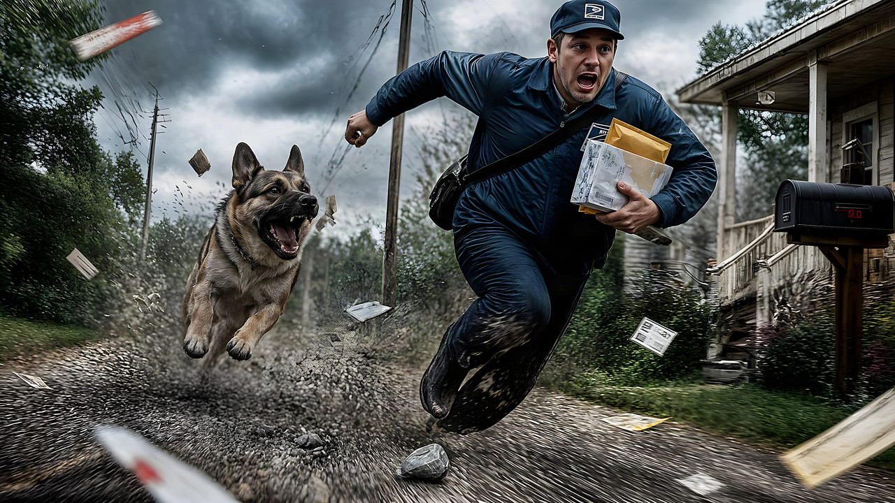
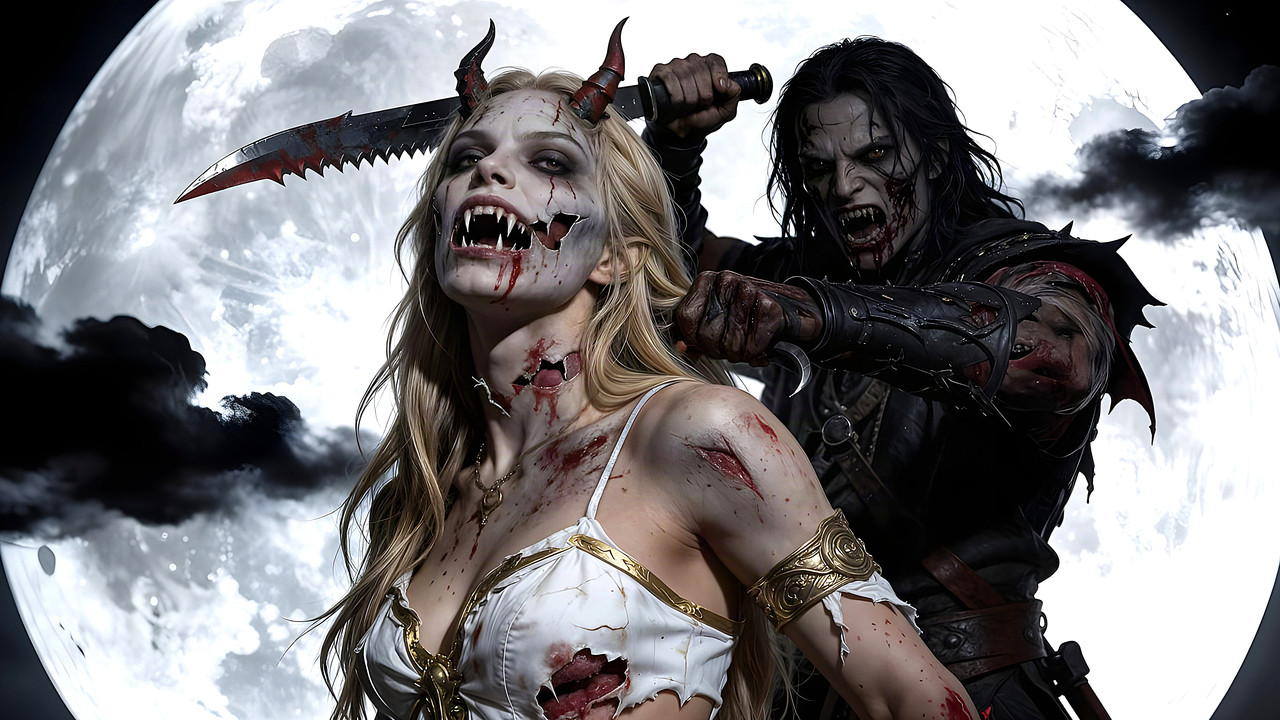
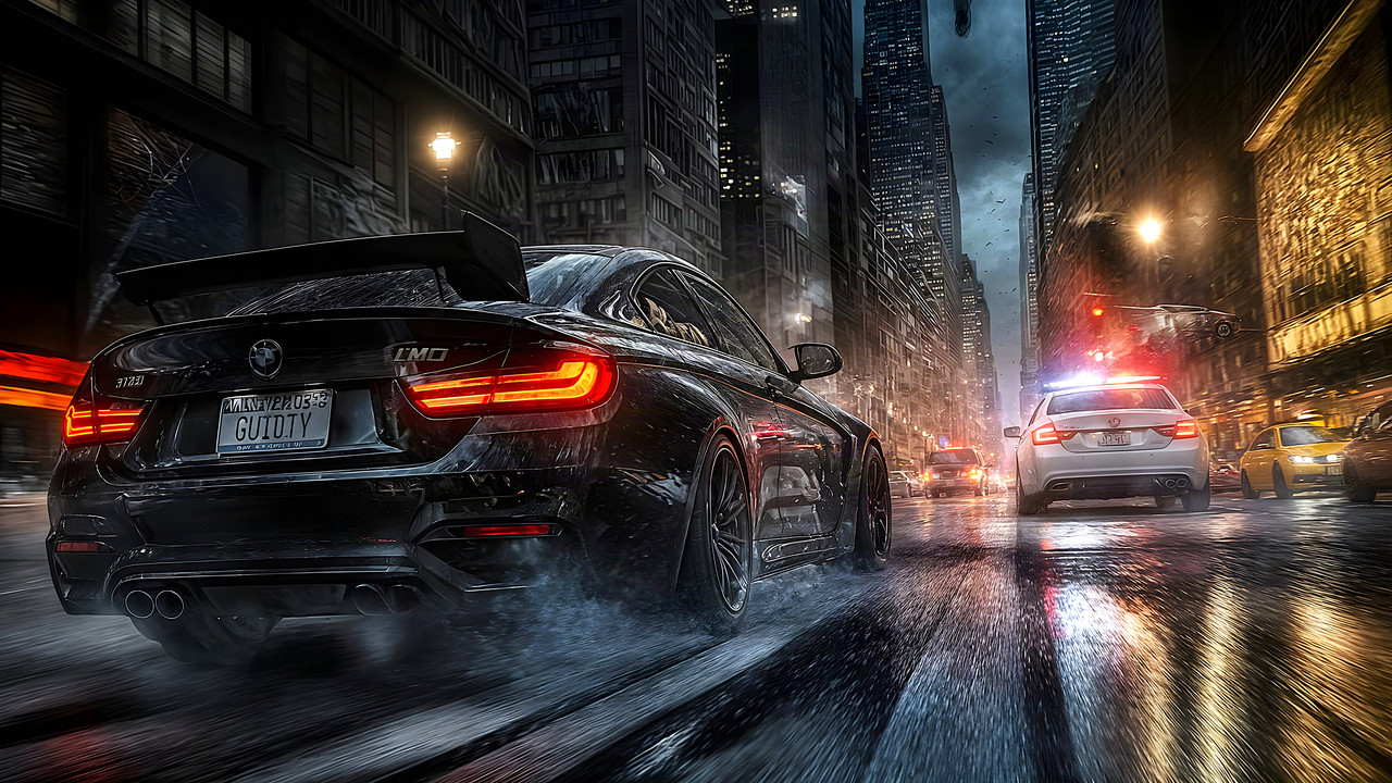
The Chase

+1 Loading…
Reply #138 Top

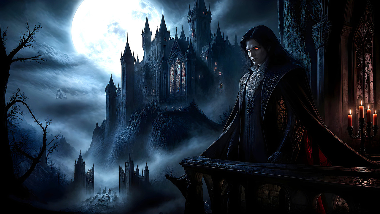
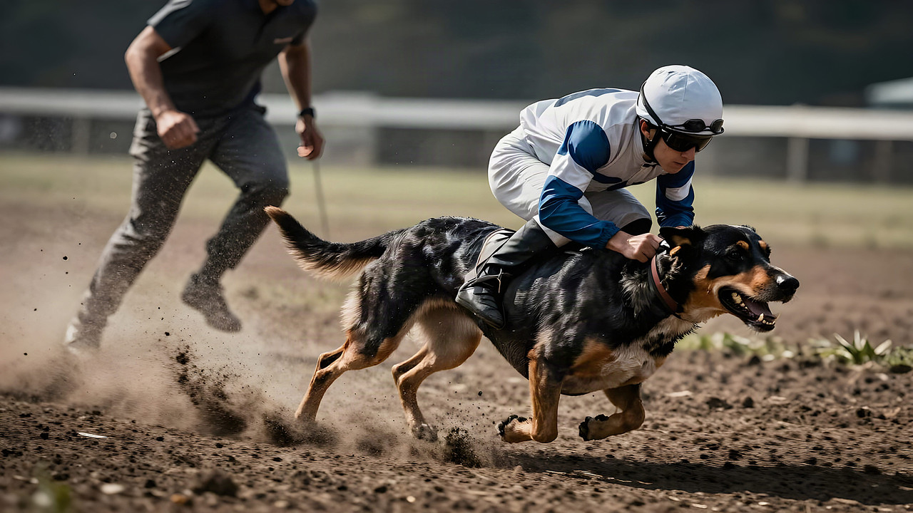
This Is An Example Of Getting Several Totally Different Creations From The Same Prompt But Different Model.

Believe It Or Not, This Has The Same Prompt As Above, Seeing As Differnt Models Have Different Streghths And Weaknesses, Its No Wonder We Get Fingers, Cars Wrong Etc..

The Chase Vol 2


+1 Loading…
Reply #139 Top

Chase vol. 2 is classic

+1 Loading…
Reply #140 Top

Looks to me as though your prompts are rather ruff. X| 

Reply #141 Top
Quoting DrJBHL, reply 4145610

Looks to me as though your prompts are rather ruff.

End of DrJBHL's quote

More Likely "Woof" Doc

Reply #145 Top

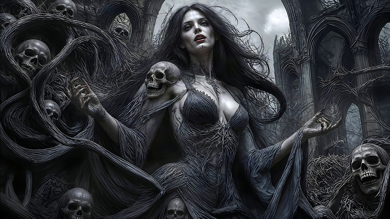
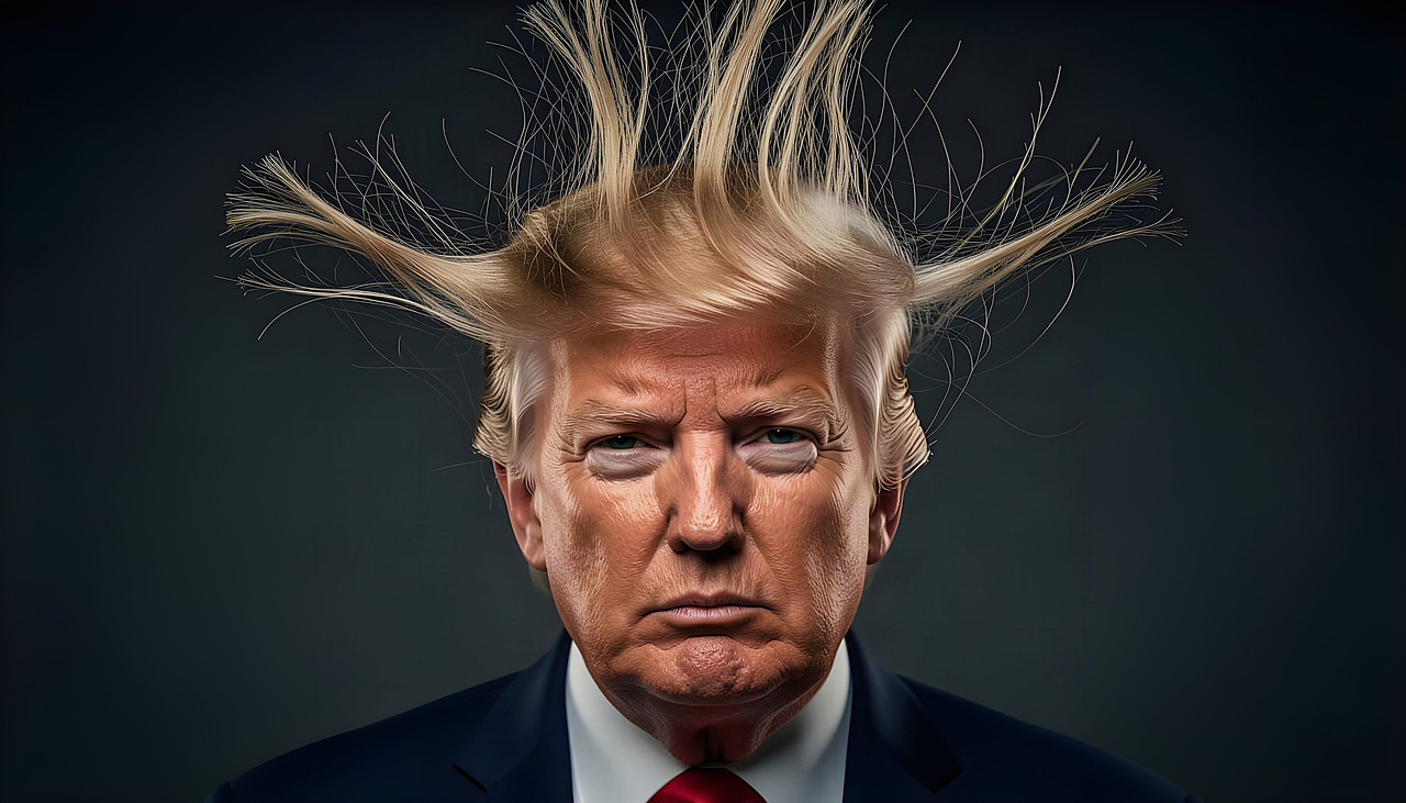
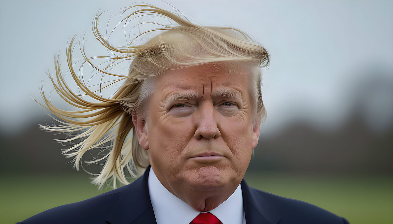
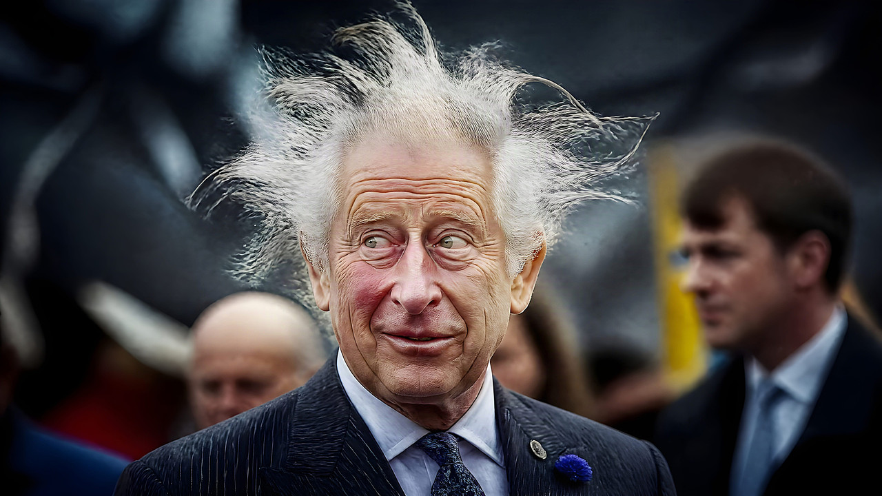
Bad Hair Day Portraits (Comp)

Reply #147 Top

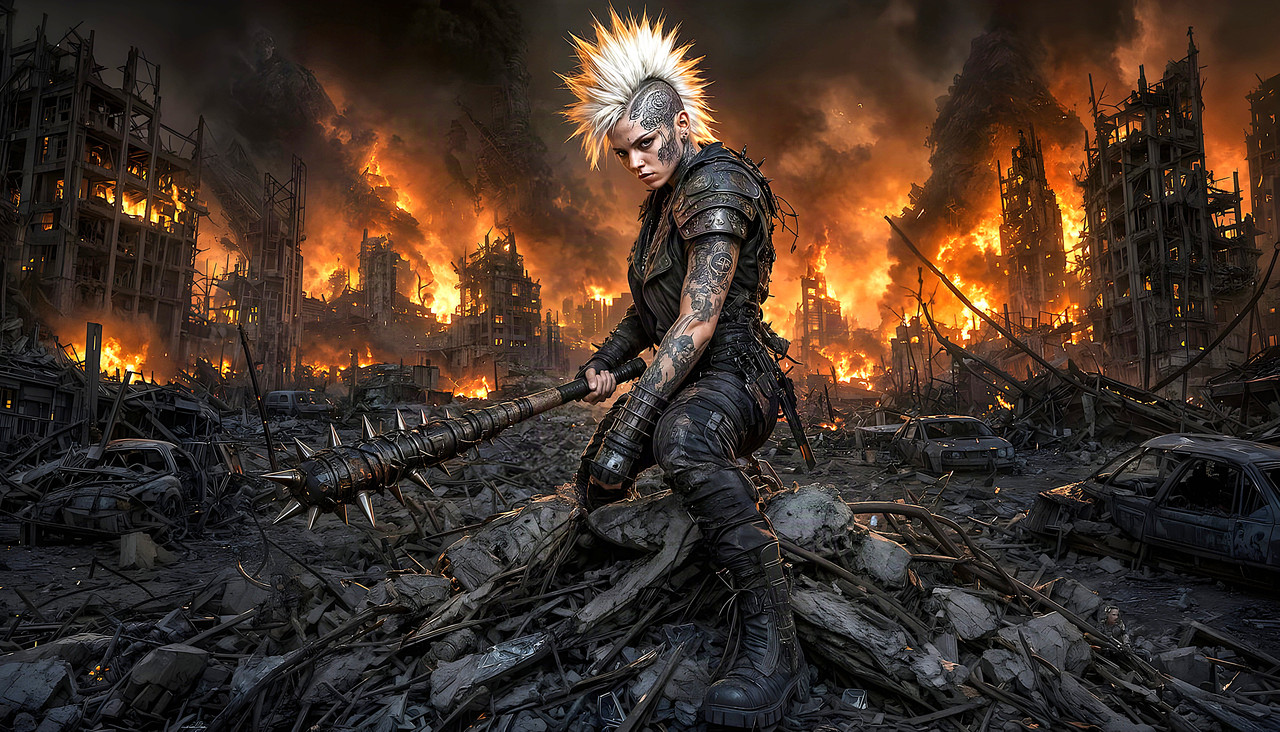
Vol 3 Arise The Kings Hair (c)