


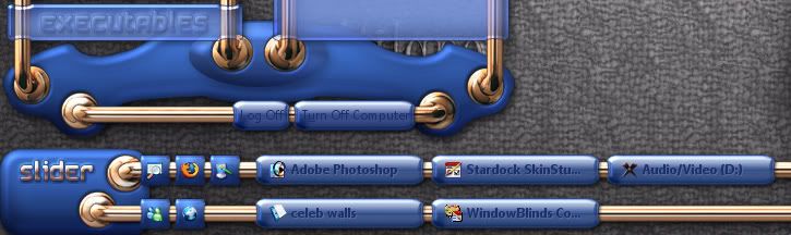
Evolution of a Masterskin...Slider XP
In the beginning...
from  WinCustomize Forums
Never at a loss for skinning ideas,I was however having trouble deciding what to start after Knot Vista.
vStyler was bugging me every damn day..."so...what you gonna do next?"
"Dammit John,I aint even finished Knot Vista yet" I says.
"maybe a theme based on the SR71 Blackbird,...or something that looks like vintage guitar equipment"
Instead I went with a chinese abacus...go figure.

vStyler was bugging me every damn day..."so...what you gonna do next?"
"Dammit John,I aint even finished Knot Vista yet" I says.
"maybe a theme based on the SR71 Blackbird,...or something that looks like vintage guitar equipment"
Instead I went with a chinese abacus...go figure.


 )
)